×
City of Napa - Logo Rebrand Design
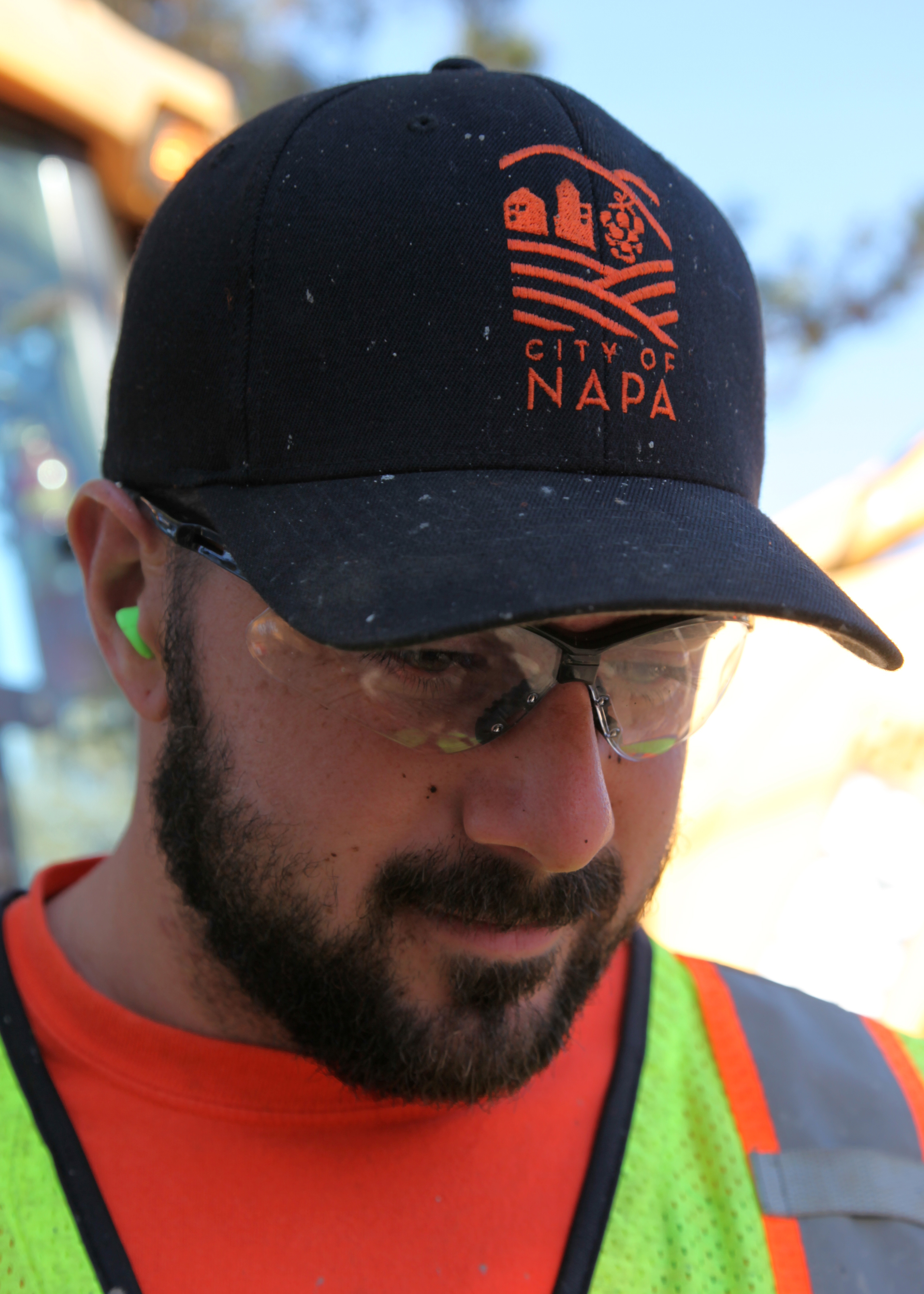
The original City of Napa logo dated back to the early 80s, selected as a winner from a contest. Thirty years later, it was time for a new one. However, when the Napa Earthquake struck on 8/24/14, it brought the project to a halt for several months. When it resumed, the essence for what made Napa distinct had made itself known—a hard working community, united to rebuild post earthquake. A shift from the original value considerations was redirected to honoring the legacy of the City's history, the surrounding Napa Valley, and a nod to the old logo while breathing in fresh liveliness into the new one. The result is what you see.
Partnered with Heather Piazza of Piazza Marketing Concepts.