
Goldridge Organic Farms - Olive Oil Branding

Goldridge Organic Farms - Apple Branding

ALDEA Courage Village Logo Design

Women's March Napa Valley 2018
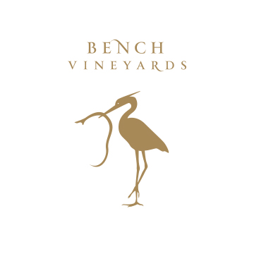
Bench Vineyards Branding & Wine Label Design

Greene's Cleaners Logo/Branding Redesign

COILED Wines Logo/Branding and Label Design

Steltzner Vineyards Logo and Label Redesign

Napa Valley Unified School District Logo/Branding Redesign

Foodshed Pizza & Pasta Logo/Branding Design

NEWS - Logo Rebrand Design

Baked by Leftfoot Logo Design

City of Napa - Logo Rebrand Design

City of American Canyon - Logo Rebrand Design

LandTrust of Napa County - Logo Rebrand Design

Napa County Library - Logo Rebrand Design

Napa County Library Literacy Center Logo Design

Hersly Wines - Logo/Label Design

Mills Family Chiropractic - Logo Design
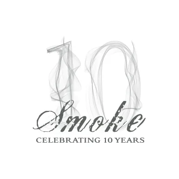
Smoke - 10 Year Anniversary Logo

Southside Cafe - Logo Design

Family Works - Logo Redesign

Distinct Bath & Body - Logo Design

American Canyon Famers' Market Logo Design

Napa Methodist Church - Logo Redesign

Altamura Construction Logo Design

Wunder-Bar Logo Rebrand and Design

AVEO Logo and Label Design

Zen Lot Logo Design

American Canyon Welcome Center Logo Design

American Canyon Chamber of Commerce Logo Design
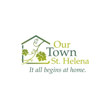
Our Town St. Helena Logo Design

Megan Reeves Photography Logo Design

Halle Group Logo Design

Vinfillment Logo Design

Napa Small Animal Hospital Logo Redesign

Anamosa Logo Design

BDCo Logo Design

A Voice Found Logo Design

Rowland Tebb Wines Logo Design

Libby Simone Logo Design

Rhoda Gravador Logo Design

Sangiacomo Logo Design
Goldridge Organic Farms - Olive Oil Branding
Goldridge Organic Farms - Apple Branding
ALDEA Courage Village Logo DesignALDEA's Courage Village was created in response to the unfortunate 2016 events of two teen suicides in Napa. A new campaign grew to create awareness, discourse around community dialogue and the hopes of providing tools for prevention, counseling and continued help for teens/parents/community moving forward.
Women's March Napa Valley 2018Leveraging the national campaign and branding established in 2017, the grass roots steering committee for Womens March Napa Valley asked Folia Design to come up with a logo that would be recognized for the local chapter and it's distinct recognition values, being in Napa Valley. With the wine industry being a big part of the name, industry and location, it seemed right to incorporate the visual of landscape and some aspect of wine into the existing branding.
Bench Vineyards Branding & Wine Label DesignHusband and wife team Sam Sharp and Allison Steltzner launched Bench Vineyards, named after the unique topography of the Steltzner’s historic 30 acre Estate, a benchland vineyard located directly below the Stags Leap District Palisades. Allison approached Julia of Folia Design in 2015 to create the new logo and branding based on the family legacy and Germanic roots in which the symbol of a heron with a snake in its mouth appeared on the family crest. The concept was a bulls eye hit for what followed in the final result.
Greene's Cleaners Logo/Branding RedesignGreene's Cleaners, a locally owned business for at least 30+ years a in Napa was ready for a new look with the younger generation taking ownership in recent years. Folia Design was appraoched to lead this task. A clean, easily recognizable and elegant brand was the goal. This is what was delivered.
COILED Wines Logo/Branding and Label DesignTrue story: When Leslie Preston approached Julia of Folia Design to come up with her logo and label design back in 2007, the selected name was based on the valley where the grapes were being sourced in Idaho: the Snake River Valley, hence COILED Wines. However, Leslie admitted she HATED snakes (emphasis on H.A.T.E.D.) so, no images of snakes was to be used! Folia Design just got clever with what part of the snake could be used.
Steltzner Vineyards Logo and Label RedesignOverhauling a long-standing, recognizable brand requires a lot of thought, research and respect for the legacy of the older brand. Much discourse and review of the family history and business occurred which brought up an old label from the 60s depicting a stag leaping out of the letter S that was applied to containers hauling away table grapes at harvest time. It was from that framed vintage label from which the new label concept took a twist and final turn.
Napa Valley Unified School District Logo/Branding RedesignWhen the NVUSD district calls upon you to redo their logo, you know it took a lot of backing for this to happen. After much consensus, the NVUSD agreed it was time to re-haul their very old and out-of-date logo. Requirements for the new logo: a look that was approachable, clean and modern, which represented community within the school district and county, and positioned the district as a technological savvy education system. Big bonus was to add in the Napa Valley aspect without it being typical. The final result is what you see.Partnered with Heather Piazza of Piazza Marketing Concepts.
Foodshed Pizza & Pasta Logo/Branding DesignThe concept for Foodshed began as a locals,' high-quality, affordable Italian eatery w/philanthropy behind it: to provide Napa’s low-income youth and at-risk/underserved populations with work experience and to bring recognition to financial donors helping interns make their next steps. With Italian heritage being at the roots of this eatery, the pizza peel (and the kind used in Italy) became an important visual. At the same time, the sunflower image was added as the original location had a bed of them to bring cheer and catch attention from the road. The end result became a fusion of delightful cheer around the culture of Italian foods at Foodshed.
NEWS - Logo Rebrand DesignNEWS, Napa Emergency Women's Services, has been a nonprofit organization in Napa since 1981, helping thousands of women and children in domestic violence situations. Through the years they've opened their doors to all: no matter what race, color, national origin, disability, gender, gender identity, sexual orientation, gender expression or age. With that, came the need for a new look & message: Nurturing. Empowerment. Worth. Safety. The new logo represents the wholeness & variety of all of people they've helped.Partnered with Heather Piazza of Piazza Marketing Concepts.
Baked by Leftfoot Logo DesignCreated as a gift for someone special, the intended recipient wasn't aware of the project's happening. A very credible and respected motorcyclist who'd suffered injuries that eventually forced him to stop racing had shifted into advancing his sourdough baking skills, and incredibly so. As a thank you for teaching Julia to embark on her own path of learning to bake, the gift of a logo and website was presented to him for the option to showcase his bread works and blog about the journey of life and baking. Using his own handwriting from previously written notes, Julia arranged the lettering to represent the most truest version of him.
City of Napa - Logo Rebrand DesignThe original city logo dated back to the early 80s, selected as a winner from a contest. Thirty years later, it was time for a new one. However, when the Napa Earthquake struck on 8/24/17, it brought the project to a halt for several months. When it resumed, the essence for what made Napa distinct had made itself known—a hard working community, united to rebuild post earthquake. A shift from the original value considerations was redirected to honoring the legacy of the City's history, the surrounding Napa Valley, and a nod to the old logo while breathing in fresh liveliness into the new one. The result is what you see.Partnered with Heather Piazza of Piazza Marketing Concepts.
City of American Canyon - Logo Rebrand DesignThe City of American Canyon was incorporated in 1992, and only had a city seal for official use that worked for branding purposes. They realized a more community-oriented, engaging logo/branding was needed. Probably a year in the making with community input, town hall meetings and focus groups, the process provided the most distilled and comprehensive assessment of goals and needs, clearly outlined and provided to Folia Design to use for creative and factual input.Partnered with Heather Piazza of Piazza Marketing Concepts.
LandTrust of Napa County - Logo Rebrand DesignThe LandTrust of Napa County does so much to protect, steward and provide the right conditions for a healthy flora—to thrive! Without the land, there would be no vineyards, no wineries, no tourism, no Napa Valley. The chance to redesign their logo, and provide a recognizable brand which communicated connection, hope, beauty, and the healthy continuation of our landscape was a deeply accepted challenge for Julia of Folia Design.
Napa County Library - Logo Rebrand DesignWhen new Library Director, Danis Kreimeier came on board, it was a big breath of fresh air and all about change. The Napa County Library was good but she wanted to make it awesome! What was designed as a logo that portrayed a modern and techie personality and about community. Culturally, the atmosphere within the library evokes a place of casual gatherings, leg up on the sofas, chattiness and of course, research. It's not the old school library of yesterday, and thank goodness!
Napa County Library Literacy Center Logo DesignShortly after the Napa County Library logo was design, the Literacy Center there requested a logo that could compliment their parent logo. This is where it landed.
Hersly Wines - Logo/Label DesignA recently married Mr. & Mrs. Hersly was recommended to Julia for design work on their new wine label, named after their own namesake. They had some ideas using the letter "H" into the graphic but weren't sure how. During conversations and review of filling out Folia Design's Brand Profiler, artistry was an important element. Julia got straight away to her pilot point pens and began drawing.
Mills Family Chiropractic - Logo DesignA feather isn't a typical image when one thinks about a chiropractor. What was special about Dr. Tanya Mills' practice and approach was in her manner of communication and lightness in approach. When asked what was most important to her around her biz, she responded without a second's thought that it was her husband and family support behind her practice and how much they loved escaping to the beach to look for rocks and feathers, and birds... she loved birds—their uplift, their lightness and freedom. That's when the concept was formed.
Smoke - 10 Year Anniversary LogoNapa's Smoke Open Fire Grill celebrated their 10 year anniversary in 2017. They needed an embellishment to their existing brand which had deep brand loyalty, so no changes to that part. Considering their specialty was open fire grilling and fine dining, the visual for smokey lettering seemed like a natural fit.
Southside Cafe - Logo DesignSometimes a project just comes together organically and efficiently. When Irma and Morgan Robinson brainstormed for a new cafe next to their business Smoke: a modern, hip, friendly, foodie-, coffee-oriented cafe that was in Napa's southern neighborhood with the name Southside. Having lived in the neighborhood for 14 years, she was excited to see this place take off and be the designer behin. Latest news as of Dec 2017, Southside has expanded to 3 locations, showing that the Morgans have the midas touch and a cool branding to go with it.
Family Works - Logo RedesignWith a name change from Apple Family Works to Family Works, and a logo that was tired, Folia Design was hired to give them a fresh look. Qualities of professionalism, approachability, and connectedness was checked for us to consider. The solution was a type-based logo, where the initials provided a sense of protection, privacy, a shelter, but one soft and connected
Distinct Bath & Body - Logo DesignBased in Chicago, Distinct Bath & Body looked to Folia Design to create their new branding for a boutique and online retail shop, selling artisanal hand-made soaps and other bath/body care products. Request was for it to be clean, elegant yet hint at the hand-made nature of their products and plant-based ingredients being a big part of it.
American Canyon Famers' Market Logo DesignThe City of American Canyon was preparing for their Farmers' Market when it was time for a logo to raise awareness to the community. Like most farmers' markets, they wanted it to communicate a local's vibe, organic produce, community & diversity. The solution: a multi-use of fonts and colors inspired by old woodblock letterforms. Letterpressed back in the day, printed ephemera engaged community and availability for literacy. The idea complimented this project's goal in doing the same but around fresh produce/foods brought by local farmers and food purveyors.Partnered with Heather Piazza of Piazza Marketing Concepts.
Napa Methodist Church - Logo RedesignThe Napa Earthquake of Aug 2014 hit the Napa Methodist Church hard, wrecking the chapel and historic elements of the architecture. Luckily, the bones of structure was still in-tact enough for planning and repairs to be made, but not without much time, money and patience. With this, was the desire to appeal to a wider, more diverse and younger group of individuals wanting to be part of their congregation. The delivered concept for the logo was inspired by the idea of a tightly woven fabric, centered around open hearts.
Altamura Construction Logo DesignLike most general contractors, Altamura Construction wanted a logo that would showcase his name solidly and around the theme of construction. The added value to his logo was to incorporate his grandfather's painting of a family crest which was a shield. The final result: a shield or "crest" that contained the tools of his trade.
Wunder-Bar Logo Rebrand and Design When you see a soda dispenser in 90% of the bars and taverns IN THE WORLD, it's Wunder-Bar. Wunder-Bar's flexible hose post-mix dispenser is the WORLD GOLD STANDARD. Well, the folks at Wunder-Bar have been making that, among other devices since the 1970s. Their logo was just as old and needed refreshing. Little known fact, the founder was a musician and a good one. He wanted this part of him to be incorporated into the logo somehow. The original logo had a more traditional musical note. The redesign incorporated it into the letter "d."
AVEO Logo and Label DesignBefore AVEO was AVEO, the name being considered was Freehand Wines, giving reference to the handmade aspect to winemaking. What the client didn't know was that the name Freehand was associated with a defunct graphic software. When reviewing the original options of names, AVEO jumped off the page, especially since the client was a pilot. The definition of AVEO is "to desire" and that was certainly something the client felt around flying. (Side note: AVEO was the first project Julia worked on post recovery mode from the Napa Earthquake in 2014. The idea to rebound and soar for her client and for herself was the initiative and focus she needed.)
Zen Lot Logo DesignJennifer Herminger, a local Napan and yogi was in transition with her previous yoga studio and wanted to come up with a new name to leverage the great location she was able to secure. The location was in a south end of the City of Napa, in a little strip mall spot, booming with new vibes, hip cafes, markets, etc. A yoga studio made it that much more exciting. Since all the businesses shared the parking lot, it made for a cozy feeling. During a brain storming session, the the meaning of a lot, a collective group or gathering of people was initiated by Julia... and the name stuck: Zen Lot.
American Canyon Welcome Center Logo DesignThe American Canyon Welcome Center was moving into it's new location in 2013, which was visible from HWY 29, a major roadway for people traveling up to Napa or splintering off to other North Bay areas. With the growth of the town's businesses, retailers, restaurants and recreational attractions, the town made it a goal to educate and attract tourists and visitors through the Welcome Center's doors and show what a vibrant community American Canyon was and continues to become.Partnered with Piazza Marketing Concepts
American Canyon Chamber of Commerce Logo DesignAlongside the American Canyon Welcome Center, the American Canyon Chamber of Commerce was seeing growth among its entrepreneur and business community. In order to support their needs and freshen its own goals and mission, they hired Folia Design to redesign their branding. The final result was a logo that represented their connection to the Napa Valley, where the City of American Canyon has become a significant area for industry provisions such as wine storage, wine bottles, corks, and foil caps. The new logo created speaks to the businesses and trade industry supporting the upper valley.Partnered with Piazza Marketing Concepts
Our Town St. Helena Logo DesignCreated for Our Town St. Helena, a non-profit with the goal of providing housing opportunities for the people vital to the economic health and well-being of St. Helena. Inspired by the people and beauty of the wineries and industry surrounding their community, a vine and grape leaf was used to capture the town's spirit.
Megan Reeves Photography Logo DesignWhen our good friend Megan Reeves of Megan Reeves Photography approached Julia to redesign her logo, it was a true welcome and sign of trust! The concept for her logo was simple: inspired by floral forms and the placement of each petal around a focused center, the logo design's aim was to reflect on Megan's approach in capturing the human spirit, a collective group or setting that captured a moment in the most authentic, real, honest and unaltered way.
Halle Group Logo DesignWhen Carrie Hays approached Julia of Folia Design, a memorable phrase caught Julia's attention immediately. “Out of the frying pan and into the fire!” A phrase Carrie Hays describes her unusual path to the field of organizational development. It became the beginning for logo exploration for Carrie's logo. Using the letterform "H" in an arrangement that looked like a campfire, the visual provided a visual means for her signature expression, describing her path into forming The Halle Group.
Vinfillment Logo DesignCreated for a direct to consumer fulfillment solutions company ensuring wines gets delivered timely and in perfect condition, a logo was created to represent an iconic symbol of just that.
Napa Small Animal Hospital Logo RedesignOne of Julia's favorite projects as Napa Small Animal Hospital is her very own veterinarian clinic for her two kitties, she was asked to design their new logo in 2016, as they were undergoing rebuilding of their facilities to offer a better environment, advanced medical provisions and overall better services. The new logo needed to be distinct from other vets in town, yet reveal the welcoming and reliable reputation the clinic had. Of course, with a name like Napa Small Animal Hospital, the logo begged to have the similar graphic in tone and feeling.
Anamosa Logo DesignFounded by Frances Anamosa, she is a donor prospect researcher and database consultant. Having worked with several nonprofits in the past back in Chicago and in Napa, Julia was familiar with the lengths to which Frances had to go through in finding donor prospects. The concept of Sherlock Holmes and a magnifying glass came up in the exploration process, and while playing with the lettering, a convenient spot for the tool to replace the letter "O" in Frances' last name seemed a clever place to "hide" it. Frances continues to be a sought after researcher and data base consultant proving her valuable "detective" skills and her logo giving a nod to it.
BDCo Logo DesignWhen the leading wine industry accounting firm asks you to design their logo, it's a big feather to add to your cap! BDCo (short for Brotemarkle, Davis & Co.) was undergoing new branding and website design to reflect the changes and growth that the company had seen in recent years. Situated in the middle of vineyards and their client base being primary wineries, it seem suiting that the logo reflect the wine industry somehow. The website, teamed with Brendan Murphy of Camaleo also show the new branding.
A Voice Found Logo DesignCreated for a small nonprofit, social services organization in Yountville, California, focusing on helping high school youths and young adults to get a leg up on taking ownership over their lives when life staggers their path to ambition. It seemed that in order to best represent the nonprofit, that the logo needed to represent the effort of those individuals, a flame showing the fiery spirit needed to do so.
Rowland Tebb Wines Logo DesignA collaborative effort between young winemaker Kevin Rowland and the more seasoned and experienced wine maker Stephen Tebb to create a beautiful series of wines under the label Rowland Tebb. With only a few vintages into the market and a rise to recognition for some amazing wines, Kevin Rowland suffered a sudden death due to an overly large heart. The irony was that Kevin was the most open book, lively, music-loving and approachable person. He is missed by many and his wine continues to sell with Todd Rowland (Kevin's dad) managing wine sales. One thing for sure, Kevin did what he loved... he was an amazing winemaker and person.
Libby Simone Logo DesignWhen a project like Libby Simone is presented, any graphic designer would jump for the opportunity! A mobile boutique with an online presence, owner of Libby Simone, Carrie Gehrke, hand picks items for a variety of body types and prices every very affordably. Julia of Folia Design created a logo that would showcase Carrie's spirit and the namesake for her business.
Rhoda Gravador Logo DesignA bay area piano instructor, working primarily with children, Rhoda needed a logo that portrayed her target market, and one that came across as friendly.
Sangiacomo Logo DesignThe Sangiacomo family has been in the bay area for over a 100 years, with Vittorio Sangiacomo arriving in 1913, later buying a 52-acre fruit tree ranch in Sonoma Valley, now known as Home Ranch. Today, Sangiacomo Family Vineyards is one of the leading grape growers of Sonoma Valley, providing grapes to vintners and wine makers in both the Sonoma and Napa Valleys. With such legacy, Folia Design created a logo that showed reverence to tradition in a classical and timeless design.
info
/
1
2
3
4
5
6
7
8
9
10
11
12
13
14
15
16
17
18
19
20
21
22
23
24
25
26
27
28
29
30
31
32
33
34
35
36
37
38
39
40
41
42
43
·
·
·
·
·
·
·
·
·
·
·
·
·
·
·
·
·
·
·
·
·
·
·
·
·
·
·
·
·
·
·
·
·
·
·
·
·
·
·
·
·
·
·